
ローディング画面をつければ完璧に再現できますが、用意できなかったので、できたやつをとりあえず載せます。参考程度に見てもらえれば良いと思います。
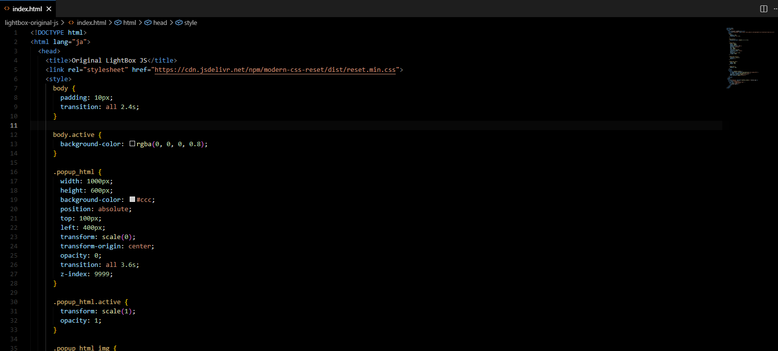
<!DOCTYPE html>
<html lang="ja">
  <head>
    <title>Original LightBox</title>
    <link rel="stylesheet" href="https://cdn.jsdelivr.net/npm/modern-css-reset/dist/reset.min.css">
    <style>
      body {
        padding: 10px;
        transition: all 2.4s;
      }

      body.active {
        background-color: rgba(0, 0, 0, 0.8);
      }

      .popup_html {
        width: 1000px;
        height: 600px;
        background-color: #ccc;
        position: absolute;
        top: 100px;
        left: 400px;
        transform: scale(0);
        transform-origin: center;
        opacity: 0;
        z-index: 9999;
      }

      .popup_html.active {
        animation: popup 2s both;
        transform: scale(1);
        opacity: 1;
      }

      @keyframes popup {
        0% {
          transform: scale(0, 0);
          opacity: 0;
        }

        30% {
          transform: scale(0.1, 0);
          opacity: 1;
        }

        60% {
          transform: scale(0.1, 1);
          opacity: 1;
        }

        100% {
          transform: scale(1, 1);
          opacity: 1;
        }
      }

      .popup_html img {
        width: 100%;
        height: 90%;
      }

      .image-text {
        padding: 10px;
      }
    </style>
    <script>
      function lightbox_window() {
        let popup_html = document.querySelector('div.popup_html');
        let body = document.querySelector('body');
        popup_html.classList.toggle('active');
        body.classList.toggle('active');
      }
    </script>
  </head>
  <body>
    <a href="#monsan" onclick="lightbox_window();">monsan.jpg</a>
    <div class="popup_html">
      <img src="./images/monsan.jpg" />
      <div class="image-text">
        <p>monsan.jpg</p>
      </div>
    </div>
  </body>
</html>実行結果はこんな感じです。少し違いますがLightBoxはローディング画面でごまかしてるようですね。
0件のコメント
コメントはまだありません。最初の一人になりましょう!